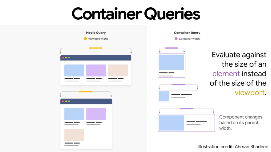
#tldr: Container Queries are another new feature coming with the Open Source release of kickstartDS. It's a proposed feature for CSS that allows the styling of elements to be based on the size of the container in which they are placed, rather than the size of whole browser frame. This is important for Design Systems because it allows for more flexibility and modularity in the design of components.
Illustration showing the difference of Media Queries in comparison to Container Queries. Credits: Ahmad Shadeed
Container Queries are the perfect evolution
In the past everyone had to rely on Media Queries when adapting the design and layout of components, especially those displaying content. When thinking about Design Systems, everyone wants to have fully-fluid components, which automatically adapt to their surrounding layout or grid. CSS Container Queries finally take care of this long-lasting pain. Therefore we, very early on, decided to rely on the use of Container Queries, even though the support in browsers is still incomplete, as of today. We believe it won't take long until it will be fully supported natively, and until then we already smooth over the currently remaining gaps with really slim polyfills. We can also already see that it was the right decision, when thinking about a starter kit for Design Systems, in the first projects utilizing them. Lately more and more articles (like this good one) also surfaced, talking about Container Queries and their use for Design Systems.
What makes Container Queries so great?
With Container Queries frontend developers can create overarching grid layouts with components in them that automatically adjust to the size of the container they are placed in, rather than having to be restricted to (and by) Media Queries ... to apply styles based on the size of the entire viewport. This allows developers to create components, developed in isolation, that can adapt to different screen sizes and devices, making them more efficient and consistently useful. Ultimately this means that a component can be used in a greater variety of contexts. Which in turn makes it easier to create flexible, responsive designs that work and improve the user experience of a product, page or interface overall.
How we approach it in kickstartDS
Components in kickstartDS are distinct units of interface, that shouldn't make any assumptions about where they're used. They should just use up all the space given to them in a responsive and efficient way.
This makes it necessary to add dedicated layout functionality to your Design System, to help users to actually create pages and interfaces out of your offered components.
We offer the Section for this purpose, especially when constructing websites, because it has some really nice convenience features implemented to aid in that. It is comparable to an "invisible component", specialized for giving you control over the targeted layout of your page, and providing context to your components / content. You can control the Gutter and Mode. While Gutter controls the amount of spacing between components, Mode is a parameter to decide on the general layout of items inside a Section. Using Mode you can choose between different display modes for your components: evenly split in a grid-like style, what we call a tile layout, evenly stretched with the default mode or vertically stacked with the list mode. Take a look into our documentation to see some more examples.
For more general requirements, not covered by our Section, we recommend using Bedrock Layouts. It integrates nicely with kickstartDS way of thinking about token, have a look at our docs section about it to learn more about hooking those two up.
Container Queries are here to stay
We want to do everything to encourage people to create their own Design System. Our best practices and design decisions, of all different kinds, should hopefully help in simplifying the process and setup. It's why we also use semantic token as one core concept presented in last week's release spotlight. With Container Queries we now showcase the use and implementation of another future-proofing functionality with this, to get the perfect fit for your components, regardless of the layout they are placed into.
Let me quote Brad Frost's view on Layout & Grid in Design Systems before you hit our docs to check it out on your own
- Design system developers create fully-fluid components and use container query syntax to manage each component's breakpoints.
- Design system developers provide layout and grid components (outlined above) for common layout solutions.
- Design system consumers do one of the following:\ a) Use design system-provided layout and grid components in their products\ b) Create product-specific custom layouts and grid solutions
- Consumers drop design system components into ds-provided or custom layouts, and those components Just Work, irrespective of the layout they are placed into.
Try it now
I hope that sparked your curiosity, and just increases your desire to try it out on your own. The best place to start are our docs, which will get their own, final Release Note soon.
If you have any questions, just join our Discord community or drop us an email to hello@kickstartds.com


Top comments (0)