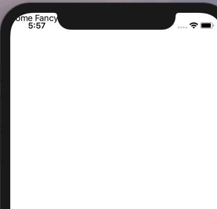
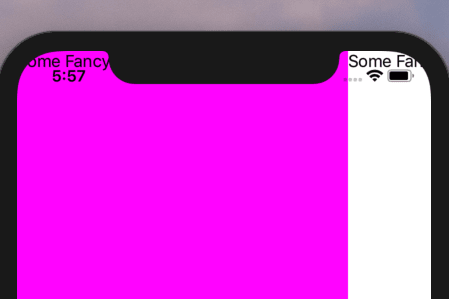
Since the launch of the iPhone X there is a notch at the top of the screen on iOS devices that tend to be annoying to work around. You would have to add some sort of margin to avoid your controls to be overlapped by it. The problem with this approach is that you would have to take into consideration wether or not the phone was in landscape or portrait mode.

To avoid these frustrations Xamarin Forms introduces a SafeArea flag that you can set on your Page Layout to ensure it’s content will automatically adjust the margin depending on the orientation of the device.
You can set it with C#
Or using XAML, see the ios namespace declared bellow and then how we set the flag right after
And you will get something like this:

One very important thing to take into consideration is that you need to set this flag for every Page you have on screen. Say for example you have a MasterDetailPage that looks like this:

To fix it you would have to set the safe area to both the Mater and the Detail Page as follows:
And now it will look like this:

This is another short one but hopefully very useful. If you liked it please share it on social media or at your local church group if you are into that. I will really appreciate it. Have a good one.
The post Layout safe areas for iOS in Xamarin Forms appeared first on Enmanuel Toribio.


Top comments (0)