Hello, this is Gaurav Gupta👋 This blog post is regarding our development progress and changes in regards to our application, our progress speed-related information as well as about the plans we have for the future. So, let's jump right into it.
Development Status
As shared in the previous post, we have decided to use the Flutter framework based on Dart to build our application. We are still learning as well as implementing our learnings to build our application concurrently so please do guide us to improve any of our shortcomings in terms of development and design practices.
❗ Heads up: You will see alignment issues throughout the application at the moment, please pay no heed, as we will be fixing this one by one.🙏
We decided to first develop a rough hard-coded design of the application, which is unresponsive, for the foundations (Right now, the application is made solely developed for a 1920x1080 fullscreen resolution, and responsiveness will be added soon). We are trying to re-create the Figma design earlier created (you can see the designs here).
Dashboard
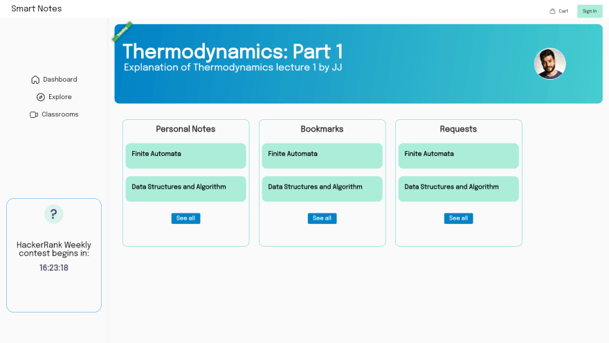
We have re-created the dashboard as closely as possible to the Figma design. As updated in our previous blog, we removed the 'Bookmarks' and 'Personal Notes' sections from the side navigation bar and moved them into the profile sub-menu. I added a small ribbon on the banner (This is temporary as I was testing new stuff out, if it looks good, we can keep it into the application, else remove it).
Explore
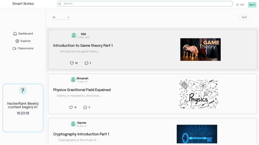
The explore page is mainly a scrollable list view of all the notes gathered in our database. The filter and sort buttons are dropdowns. I'll try to stylize them into a much better form (If you have any idea of how can I approach the styling of dropdowns that we had in our designs, please contact me through the links at the end of the post).
Classroom
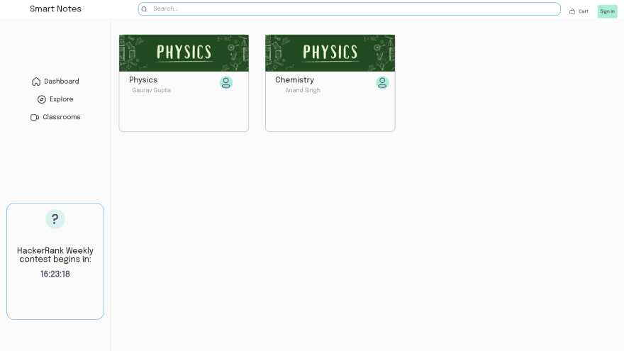
Like you can see, there is no significant difference in terms of the design of the classroom section (except the extremely horrendous text alignment of course).
Sign In / Sign Up
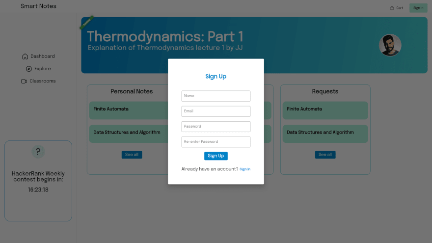
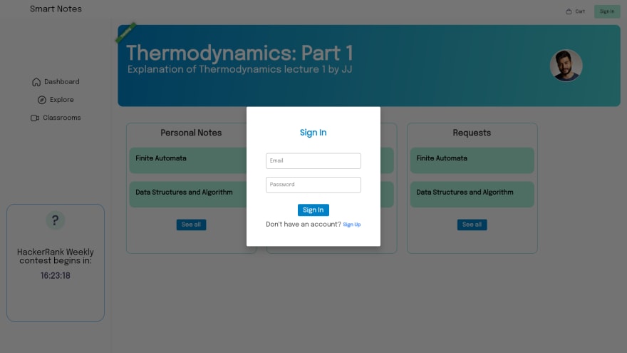
We made a simple and function 'Sign In' and 'Sign Up' alert dialog. From the images earlier you can see that these can be accessed everywhere from the app bar. These are fully functional thanks to our sole backend developer @Shivansh Pandey. After signing up, the user can access the 'Personal Notes' and 'Bookmarks' sections (which I'm working on right now) through a small pop-up menu.
What is functioning?
You may be thinking that I'm always just sharing about the designs and the frontend portion of the application does anything even work or is it just for show?👀
- Like I stated earlier, the sign-up and sign-in are fully functional allowing users to sign up and login into their accounts and access the 'Bookmarks' and 'Personal Notes' sections.
- Addition of notes is also working allowing the explore page to update on the addition of new notes.
- Shivansh has almost finished making the Dashboard 'Personal Notes' and 'Bookmarks' previews for dynamic updation according to the notes inside them.
What are you using as a backend?
We are using Firebase as the backend service for our application. Right now, Shivansh is also planning to start sharing a bit about how the backend of the application functions on his profile(You can visit his profile from here).
Being the sole backend developer as well as being new to flutter and Firebase, he has it tougher, and is pouring in hours to learn and implement things, so please support him if he starts blogging.
Hurdles
Right now, as flutter desktop is comparatively new, Firebase currently doesn't support it. So we are testing the application out as a web app, hopefully Firebase soon extends its support to the desktop.
Why is our progress so slow?
You may be thinking that the update posts and progress are pretty slow for the application. This is because of the massive workload we have received in academics. We are trying our best to balance the amount of work we put into this project and our studies, but due to a series of college projects, assignments and exams our progress has drastically slowed down and so is my consistency in posting blogs.
So how long will this continue?
Right now for about 4 weeks are left for the semester to end, till then I'll try to post our updates whenever I'm free for my studies, so please bear with us🙏. After that, since we'll be having our holidays, I'll try to post as many blogs as possible and make significant and rapid progress on the development.
We deeply apologize for the slow speed and poor consistency and work harder to get this application ready to use as early as possible.🙏
Future Plans
- As for when will the development become open-source, we plan to work on this post our first phase launch (we would like to achieve that much on our own to gauge our skills in this new tech stack).
- The note-gathering form/method would be up by the next month mid (probably right after the end of our exams or even earlier).
- If you would like to see snippets of the code and would like to know more about the working then do comment and we can share it in our upcoming blogs.
Conclusion
That is all for this blog post regarding our progress. If you want to give us any suggestions, or guidance to improve our product then do feel free to comment or reach out to me via any platform links mentioned below.
Bye 👋




Top comments (0)