What i've learnt from the grid essentials lesson of Codecademy's CSS course.
- The grid method is another way of laying out elements on a web page.
-
This lesson will include the following grid properties to create grid layouts:
- grid-template-columns
- grid-template-rows
- grid-template
- grid-template-area
- grid-gap
- grid-row-start / grid-row-end
- grid-column-start / grid-column-end
- grid-area
To set up a grid you need a grid container (parent) and grid items (children) - the grid container applies overarching styling and positioning.
To turn an HTML element into a grid container you must set its CSS display property to grid (if its a block level grid) or inline-grid (if its an inline grid). After that you can assign other properties to lay it out.
HTML:
<body>
  <div class="grid">
    <div class="box a">A</div>
    <div class="box b">B</div>
    <div class="box c">C</div>
    <div class="box d">D</div>
    <div class="box e">E</div>
    <div class="box f">F</div>
    <div class="box g">G</div>
  </div>
</body>

CSS:
.grid {
  border: 2px blue solid;
  width: 400px;
  height: 500px;
  display: grid;
}
- By setting width and height properties it means that the grid will always be that size no matter the size of the browser. If you delete these properties the grid will increase or decrease in size if the browser is made bigger or smaller (i think!)
Grid-template-columns
- By default grids have just one column. We use grid-template-columns to define the number of columns.
- Eg. grid-template-columns: 100px 200px - these values are each the width of a column and as there are two values, it knows there will be two columns.
- values can be given in px or as % of the total grid width.
- The values can be a mixture of px or %
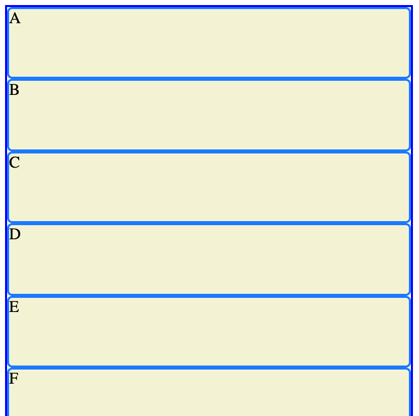
The grid from the code above would look like this:

- If you add the grid-template-column CSS:
.grid {
  border: 2px blue solid;
  width: 400px;
  height: 500px;
  display: grid;
  grid-template-columns: 100px 50% 200px
}
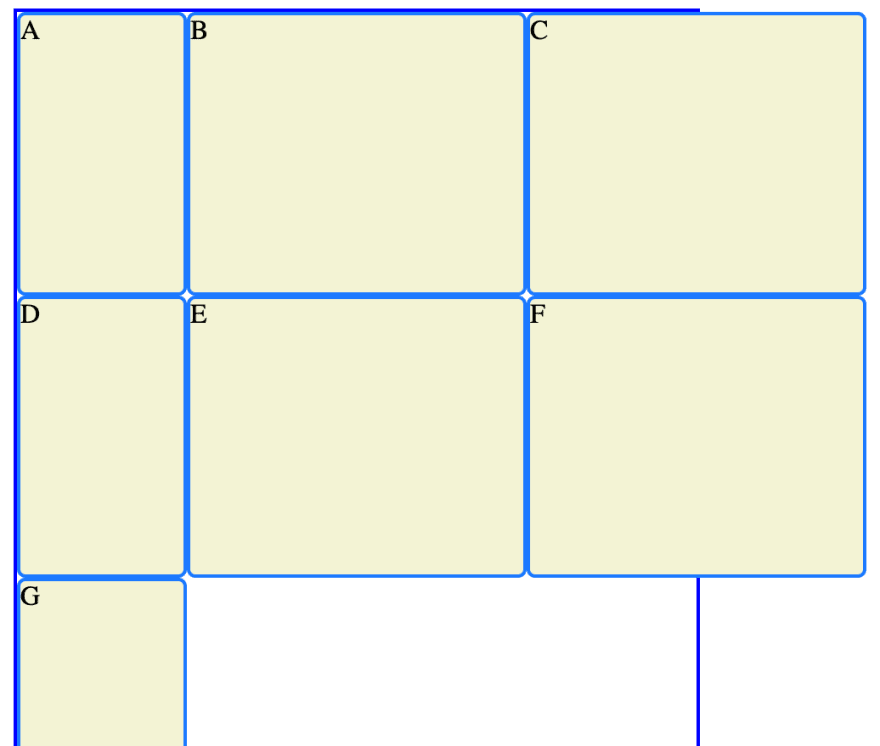
so the grid items still stay in that order and go from left to right.
some items are outside the grid boundaries but this will apparently be fixed later!
Grid-template-rows
- Works pretty much identically to grid-template-columns...except for rows! The rows are defined as a percentage of the grids total height.
- In the example below the first two rows are fairly similar heights and the last one is pretty small in comparison.
.grid {
  display: grid;
  border: 2px blue solid;
  width: 400px;
  height: 500px;
  grid-template-columns: 100px 50% 200px;
  grid-template-rows: 40% 50% 50px;
}
Grid-template
- You can forget the first two properties and use this if you like!
grid-template: 200px 300px / 20% 10% 70%;
- The first two values for this property specify the number and height of the rows, the values after the slash specify the number and width of your columns.
Fraction
- We've already seen that values for rows and columns can be given as px and % (codecademy said em and rem can also be used, i had to google these and kind of understand them, but not going to go into them here!)
- fraction was also introduced for grid as a way of sectioning off the rows/columns without them going over the grid limits.
grid-template: 2fr 1fr 1fr / 1fr 3fr 1fr;
- In the example above, there are still 3 rows (the first set of values) but the grid height is split into four. The first row gets 2 quarters of this, the last two rows get 1 quarter each.
- The width of the grid (second set of values) is split into 5 equal parts, the first and last column will be 1 fifth of the width each, the second column will be 3 fifths of the width.
- fractions can also be mixed with px and % units.
Repeat function
- Rather than specify each row/column value you can use the repeat function.
grid-template-columns: repeat(3, 100px);
- In the above example there will be 3 columns of 100px each.
grid-template-rows: repeat(5, 1fr);
It can also be used with fraction, so here there would be 5 rows of equal height.
The second parameter of the repeat function can have multiple values e.g:
grid-template-columns: repeat(2, 20px 50px)
- Here there would be four columns. The first and second would be 20px and 50px and the 3rd and 4th would also be 20px then 50px.
Minmax function
- You might sometimes want your rows/columns to have a min or max size due to what is contained within it. E.g. a 100px image should not be in a grid box smaller than 100px.
.grid {
  display: grid;
  grid-template-columns: 100px minmax(100px, 500px) 100px;
}
- In this example, the first and third columns will stay as 100px. The second column can't go smaller than 100px or larger than 500px but it can vary between these values if the overall grid resizes.
- For this example to work you need to remove the grid width property (see first example in this post)
- If you do this then make your browser window larger, the other columns will get bigger when the minmax column reaches its max size.
Grid-gap
- You can use grid-gap to give space between the rows and columns in your grid.
- The gaps are just in-between rows and columns and not at the top/bottom/sides.
.grid {
  display: grid;
  width: 320px;
  grid-template-columns: repeat(3, 1fr);
  grid-column-gap: 10px;
  grid-row-gap: 15px;
}
- These gaps are included in the grid width. Say the grid width was 320px and there are two gaps between the three columns. That leaves 300px for the three columns which are 1fr each = each column is 100px.
-The column and row gaps can be specified in separate properties like above or you can put them in the same property grid-gap
grid-gap: 20px 5px;
- Here, the row gaps would be 20px and the column gaps would be 5px.
Grid items
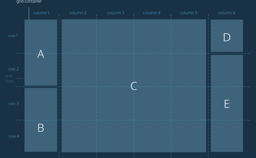
- So far, grid items have just taken up space in one square of our grid. E.g. in the image below items A, B, C and E take up more than one row and C spans more than one column too.

Grid-row-start & grid-row-end
- Using these properties you can make grid items take up several rows like in the image above.
- The values that you give these properties are the gridlines, not the grid rows.
.item {
  grid-row-start: 1;
  grid-row-end: 3;
}
- Therefore, the item above would take up two rows. It would start on row 1 and end on row 2. (Think of these values as the gridlines either side of the item.
Grid-row
- You can use the shorthand of grid-row to replace using both of the properties above. The example below gives exactly the same output (number before the slash is row start and after the slash is row end.
- These properties include any grid-gap that is included in the css.
.item {
  grid-row: 1 / 3;
}
Grid-column and span
- The properties above also exist for column and work in exactly the same way.
- Instead of specifying an end column or row you can use span
- In the example below, item 'b' starts in column 2 and spreads across 6 columns. and it starts in row 2 and takes up 3 rows.
.b {
  grid-column: 2 / span 6;
  grid-row: 2 / span 3;
}
Grid-area
- You can refactor the code above further by just using grid-area instead.
- The values are set in this order:
- grid-row-start
- grid-column-start
- grid-row-end
- grid-column-end
- Span can still be used.
.a {
  grid-area: 5 / 1 / span 2 / span 2;
}
Example
- Example code using the properties above and the output it gives.
HTML

<body>
  <div class="grid">
    <div class="box a">A</div>
    <div class="box b">B</div>
    <div class="box c">C</div>
    <div class="box d">D</div>
    <div class="box e">E</div>
  </div>
</body>

CSS

.grid {
  display: grid;
  border: 2px blue solid;
  height: 500px;
  width: 500px;
  grid-template-columns: 25% 25% 2fr 1fr;
  grid-template-rows: 200px 200px;
  grid-column-gap: 15px;
  grid-row-gap: 10px;
}

.box {
  background-color: beige;
  color: black;
  border-radius: 5px;
  border: 2px dodgerblue solid;
}

.a {
  grid-column: 1 / span 2;
  grid-row-start: 1;
  grid-row-end: 3;
}
- The code below gives the same output, but it has been refactored to use the properties that are more concise (right word??)
.grid {
  display: grid;
  border: 2px blue solid;
  height: 500px;
  width: 500px;
  grid-template: 200px 200px / 25% 25% 2fr 1fr;
  grid-gap: 10px / 15px;
}

.box {
  background-color: beige;
  color: black;
  border-radius: 5px;
  border: 2px dodgerblue solid;
}

.a {
  grid-area: 1 / 1 / span 2 / span 2;
}
That's it! Advanced grid next...


Top comments (1)
Powerful presentation