
Day 15 of 365 Days of Coding! Today we are doing some more CSS work!
Disclaimer: there are MANY ways to solve this problem this is an answer that I would see or use in a coding interview and would accept as a proper answer
TLDR: Solution is at the bottom of the post
Repo for this challenge: https://github.com/hellodevworldblog/spinner
The Problem
Create a loading spinner animation with only HTML and CSS
The Solution
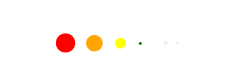
this is what the spinner is going to look like
First we need to make html elements for all of our dots. We will make these spans into dots and animate them with CSS.
<div class="loader">
    <span class="dot"></span>
    <span class="dot"></span>
    <span class="dot"></span>
    <span class="dot"></span>
    <span class="dot"></span>
    <span class="dot"></span>
</div>
I want to center my spinner on the page so I am going to style the loader div to do that.
    .loader {
        width: 100%;
        height: 100%;
        display: flex;
        justify-content: center;
        align-items: center;
    }
For the dot I am going to make them 40px if you wanted them bigger or smaller just change the height and width. I am also making the border-radius 50% to make the spans circles and adding an animation for them. Animation has a lot of different properties you can add to it but the ones I am adding are keyframes name (we will go over this a little farther down), duration (how long the animation is for), and animation-iteration-count (how many times you want the animation to play). We are going to make animation-iteration-count infinite because we don’t know how many times we want to to play while its showing we just want it to be animated.
    .dot {
        width: 40px;
        height: 40px;
        margin-right: 20px;
        border-radius: 50%;
        animation: breathe 2000ms infinite;
    }
For each dot that we created I want to make it a color and set the delay. This is will delay the animation that we set to that amount. Each one will animate in the same way as we defined in the dot class but the animation will be delayed so it will create more of a breathing effect instead of having them all animate the same way at the same time.
:nth-child will take that number child of that class and add whatever effect to it. There are 6 dots and each of those dots have the class “dot” and is a “child” of that class in CSS so the first dot is :nth-child(1) etc. etc. Notice this is not 0 indexed like other indexes so the first one is actually child 1 instead of child 0
    .dot:nth-child(1) {
        background: red;
        animation-delay: 100ms;
    }

    .dot:nth-child(2) {
        background: orange;
        animation-delay: 300ms;
    }

    .dot:nth-child(3) {
        background: yellow;
        animation-delay: 500ms;
    }

    .dot:nth-child(4) {
        background: green;
        animation-delay: 700ms;
    }

    .dot:nth-child(5) {
        background: blue;
        animation-delay: 900ms;
    }

    .dot:nth-child(6) {
        background: purple;
        animation-delay: 1100ms;
    }
Lastly we have to add the keyframes to tell the animation what to do. The name after the “@keyframes” is the name of the keyframes that I was referencing earlier. The percentages in the keyframes represents the the percentage in the duration of animation the transform is happening. So 50% in the keyframes is 50% of the way through the animation sequence.
Half way through the animation I am going to set the height and width to 0 which will make the dot gradually go from 40 to 0px until half way through the animation. This along with the offset will cause the breathing effect as they will gradually disappear and get closer/will move so it will create a breathing type effect. if you don’t want the dots to move and just get bigger and smaller you can use scale instead. This will make the circle itself smaller without changing the width or the height. The dots will stay in the same place and just get bigger and smaller in order instead of moving.
At the end I am using transform and scale(1) to make the circles back to the original size they were. This will make the dots gradually go from width and height 0 to 40px from the middle to the end of the animation
    @keyframes breathe {
        50% {
            width: 0;
            height: 0;
        }
        100% {
            transform: scale(1);
        }
    }
This is what the file file will look like
<div class="loader">
    <span class="dot"></span>
    <span class="dot"></span>
    <span class="dot"></span>
    <span class="dot"></span>
    <span class="dot"></span>
    <span class="dot"></span>
</div>

<style>
    .loader {
        width: 100%;
        height: 100%;
        display: flex;
        justify-content: center;
        align-items: center;
    }

    .dot {
        width: 40px;
        height: 40px;
        margin-right: 20px;
        border-radius: 50%;
        animation: breathe 2000ms infinite;
    }

    .dot:nth-child(1) {
        background: red;
        animation-delay: 100ms;
    }

    .dot:nth-child(2) {
        background: orange;
        animation-delay: 300ms;
    }

    .dot:nth-child(3) {
        background: yellow;
        animation-delay: 500ms;
    }

    .dot:nth-child(4) {
        background: green;
        animation-delay: 700ms;
    }

    .dot:nth-child(5) {
        background: blue;
        animation-delay: 900ms;
    }

    .dot:nth-child(6) {
        background: purple;
        animation-delay: 1100ms;
    }

    @keyframes breathe {
        50% {
            width: 0;
            height: 0;
        }
        100% {
            transform: scale(1);
        }
    }
</style>
I hope you had fun with this one! Please leave your repo links to your form in the comments section. Also let me know if you like the multi day challenges or really hate them! If you have any challenge you would like to see done also leave that in the comments below you may see it come up! If you would like to get the challenge emailed to you every day in morning and a notification when the solution is posted subscribe below.


Top comments (4)
Why there is no role="status" ?
You can definitely add it if you want it’s just not necessary so I didn’t but definitely doesn’t hurt! :)
Thanks !!
Some comments may only be visible to logged-in visitors. Sign in to view all comments.