There are lots of machine learning algorithms for supervised learning, and they can be broadly divided into two types:
Regression algorithms: Algorithms that predict a y value that is a numeric value, such as the price of a house or the number of sales transactions.
Classification algorithms: Algorithms that predict to which category, or class, an observation belongs. The y value in a classification model is a vector of probability values between 0 and 1, one for each class, indicating the probability of the observation belonging to each class.
Calculating a regression line for a simple binomial (two-variable) function from first principles is possible, but involves some mathematical effort. When you consider a real-world dataset in which x is not a single feature value such as temperature, but a vector of multiple variables such as temperature, day of the week, month, rainfall, and so on; the calculations become more complex.
For this reason, data scientists generally use specialized machine learning frameworks to perform model training and evaluation. Such frameworks encapsulate common algorithms and provide useful functions for preparing data, fitting data to a model, and calculating model evaluation metrics.
One of the most commonly used machine learning frameworks for Python is scikit-learn, and in this hands-on exercise, you'll use scikit-learn to train and evaluate a regression model.
The data used in this exercise is derived from Capital Bikeshare and is used under the published license agreement.
Explore the data
The first step in any machine learning project is to explore the data that you will use to train a model. The goal of this exploration is to try to understand the relationships between its attributes; in particular, any apparent correlation between the features and the label your model will try to predict. This may require some work to detect and fix issues in the data (such as dealing with missing values, errors, or outlier values), deriving new feature columns by transforming or combining existing features (a process known as feature engineering), normalizing numeric features (values you can measure or count) so they're on a similar scale, and encoding categorical features (values that represent discrete categories) as numeric indicators.
Let's start by loading the bicycle sharing data as a Pandas DataFrame and viewing the first few rows.
import pandas as pd

# load the training dataset
bike_data = pd.read_csv('daily-bike-share.csv')
bike_data.head()
In this dataset, rentals represent the label (the y value) our model must be trained to predict. The other columns are potential features (x values).
As mentioned previously, you can perform some feature engineering to combine or derive new features. For example, let's add a new column named day to the dataframe by extracting the day component from the existing dteday column. The new column represents the day of the month from 1 to 31.
bike_data['day'] = pd.DatetimeIndex(bike_data['dteday']).day
bike_data.head(32)
OK, let's start our analysis of the data by examining a few key descriptive statistics. We can use the dataframe's describe method to generate these for the numeric features as well as the rentals label column.
numeric_features = ['temp', 'atemp', 'hum', 'windspeed']
bike_data[numeric_features + ['rentals']].describe()
The statistics reveal some information about the distribution of the data in each of the numeric fields, including the number of observations (there are 731 records), the mean, standard deviation, minimum and maximum values, and the quartile values (the threshold values for 25%, 50% - which is also the median, and 75% of the data). From this, we can see that the mean number of daily rentals is around 848; but there's a comparatively large standard deviation, indicating a lot of variance in the number of rentals per day.
We might get a clearer idea of the distribution of rentals values by visualizing the data. Common plot types for visualizing numeric data distributions are histograms and box plots, so let's use Python's matplotlib library to create one of each of these for the rentals column.
Visualize the data
import pandas as pd
import matplotlib.pyplot as plt

# This ensures plots are displayed inline in the Jupyter notebook
%matplotlib inline

# Get the label column
label = bike_data['rentals']


# Create a figure for 2 subplots (2 rows, 1 column)
fig, ax = plt.subplots(2, 1, figsize = (9,12))

# Plot the histogram
ax[0].hist(label, bins=100)
ax[0].set_ylabel('Frequency')

# Add lines for the mean, median, and mode
ax[0].axvline(label.mean(), color='magenta', linestyle='dashed', linewidth=2)
ax[0].axvline(label.median(), color='cyan', linestyle='dashed', linewidth=2)

# Plot the boxplot
ax[1].boxplot(label, vert=False)
ax[1].set_xlabel('Rentals')

# Add a title to the Figure
fig.suptitle('Rental Distribution')

# Show the figure
fig.show()
Output
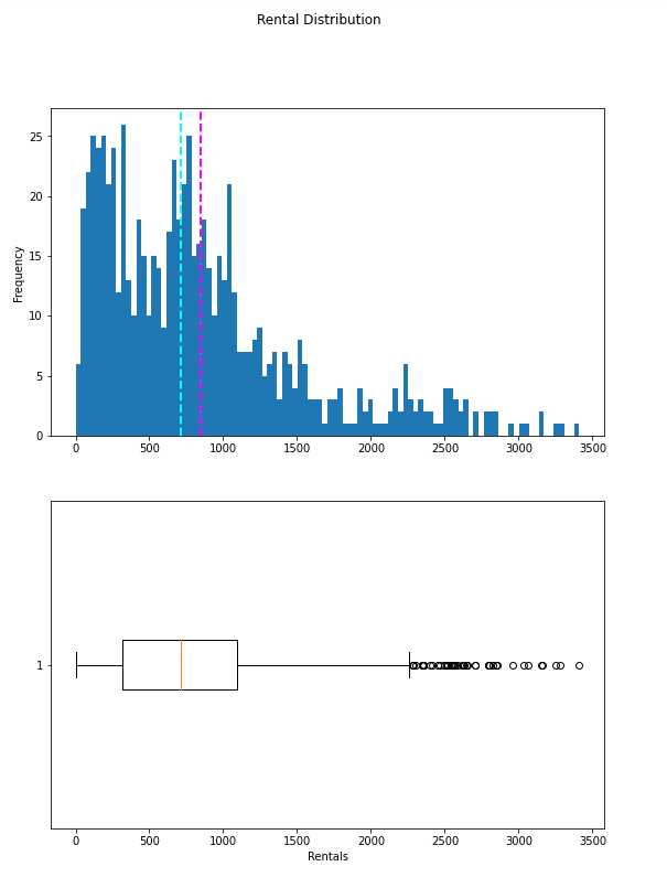
The plots show that the number of daily rentals ranges from 0 to just over 3,400. However, the mean (and median) number of daily rentals is closer to the low end of that range, with most of the data between 0 and around 2,200 rentals. The few values above this are shown in the box plot as small circles, indicating that they are outliers - in other words, unusually high or low values beyond the typical range of most of the data.
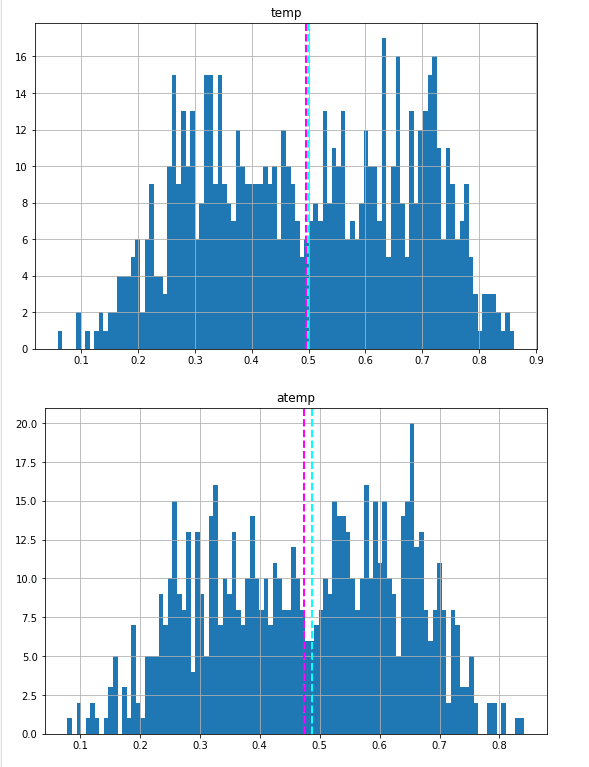
We can do the same kind of visual exploration of the numeric features. Let's create a histogram for each of these.
for col in numeric_features:
    fig = plt.figure(figsize=(9, 6))
    ax = fig.gca()
    feature = bike_data[col]
    feature.hist(bins=100, ax = ax)
    ax.axvline(feature.mean(), color='magenta', linestyle='dashed', linewidth=2)
    ax.axvline(feature.median(), color='cyan', linestyle='dashed', linewidth=2)
    ax.set_title(col)
plt.show()
Output
We've explored the distribution of the numeric values in the dataset, but what about the categorical features? These aren't continuous numbers on a scale, so we can't use histograms, but we can plot a bar chart showing the count of each discrete value for each category.
import numpy as np

# plot a bar plot for each categorical feature count
categorical_features = ['season','mnth','holiday','weekday','workingday','weathersit', 'day']

for col in categorical_features:
    counts = bike_data[col].value_counts().sort_index()
    fig = plt.figure(figsize=(9, 6))
    ax = fig.gca()
    counts.plot.bar(ax = ax, color='steelblue')
    ax.set_title(col + ' counts')
    ax.set_xlabel(col)
    ax.set_ylabel("Frequency")
plt.show()
Output
Now that we know something about the distribution of the data in our columns, we can start to look for relationships between the features and the rentals label we want to be able to predict.
for col in numeric_features:
    fig = plt.figure(figsize=(9, 6))
    ax = fig.gca()
    feature = bike_data[col]
    label = bike_data['rentals']
    correlation = feature.corr(label)
    plt.scatter(x=feature, y=label)
    plt.xlabel(col)
    plt.ylabel('Bike Rentals')
    ax.set_title('rentals vs ' + col + '- correlation: ' + str(correlation))
plt.show()
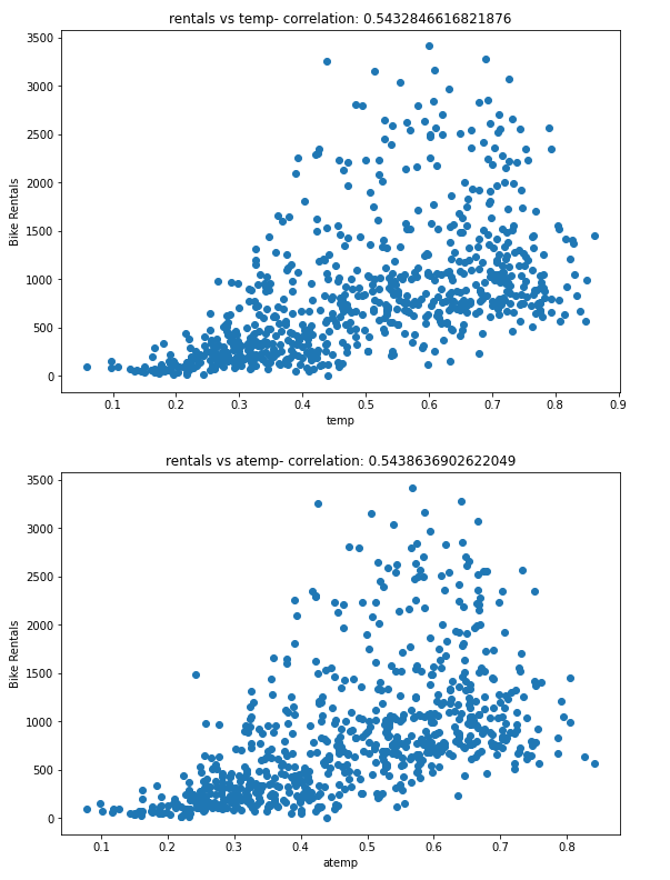
The results aren't conclusive, but if you look closely at the scatter plots for temp and atemp, you can see a vague diagonal trend showing that higher rental counts tend to coincide with higher temperatures; and a correlation value of just over 0.5 for both of these features supports this observation. Conversely, the plots for hum and windspeed show a slightly negative correlation, indicating that there are fewer rentals on days with high humidity or wind speed.
# plot a boxplot for the label by each categorical feature
for col in categorical_features:
    fig = plt.figure(figsize=(9, 6))
    ax = fig.gca()
    bike_data.boxplot(column = 'rentals', by = col, ax = ax)
    ax.set_title('Label by ' + col)
    ax.set_ylabel("Bike Rentals")
plt.show()
The plots show some variance in the relationship between some category values and rentals. For example, there's a clear difference in the distribution of rentals on weekends (weekday 0 or 6) and those during the working week (weekday 1 to 5). Similarly, there are notable differences between the holiday and working day categories. There's a noticeable trend that shows different rental distributions in the summer and fall months compared to spring and winter months. The weather's category also seems to make a difference in rental distribution. The day feature we created for the day of the month shows little variation, indicating that it's probably not predictive of the number of rentals.


Top comments (0)