I haven't posted much but I am still learning.
I completed the Bootstrap section and now I am doing the HTML & CSS projects through the Odin Project.
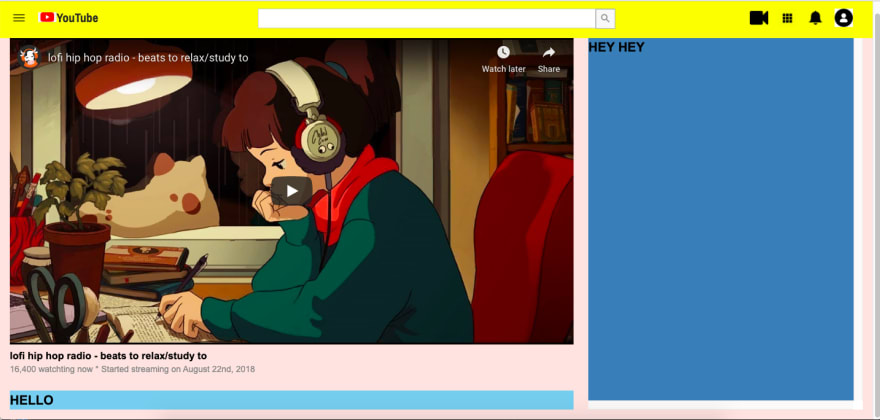
The first project that I am working on is recreating a YouTube page. This time I am practicing using the Grid and Flexbox to create the layout.
The goal of that assignment is to work images, audios and videos but I am taking the opportunity to practice thinking through and organizing my layout.
Below is a picture of where I am at and a short breakdown.
1- The navigation is laid out in a grid of 3 columns. I used Flexbox to align the icons on the left and right columns. The middle column is a text input and an icon on the side. I could have used picture for the entire nav bar but I wanted to use the icons and figure out how to align them properly. The challenging part of this section was the search bar. It is not aligned as well as I would like to and it is on the list to be revised.
2- I used the Grid again for the rest of the page and as you can see I love using different background colors to see how the elements are on the page especially if it is a page that requires a light background. I will complete this tomorrow and start this other project that is a login page.
It is so much fun to do this and I am so proud and happy whenever I see something that I spend so much time on work out so nicely.
On to the next one!


Top comments (0)