SVG interactions to improve your UX with UI
Animations are the best way to bring life to our websites: they help us tell stories and communicate what is happening at that moment. They naturally catch our attention so it’s important to learn how and when to apply them. If we use animations in the right way, we can improve our website’s usability, if we abuse them we can ruin the user experience.
In this article we’ll show an example of interactive animations, the ones that appear right after the users take an action and can help them notice the results.
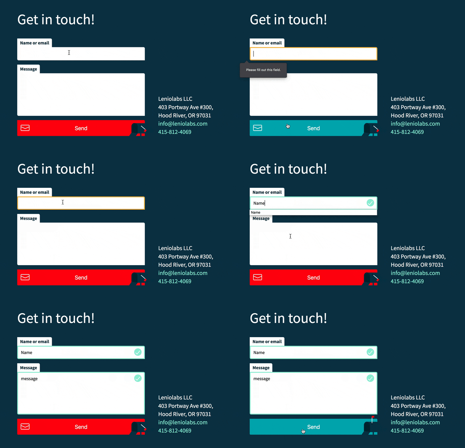
A good case for using SVG interactions are form validations. We can let the user know what is happening at the time they interact with the inputs. This is an example that you can find at our Leniolabs website.
In this example we need both inputs to be filled. As soon as the user types any letter the green check icon will confirm that the input is valid. This is a small interaction that we can achieve by adding the required HTML5 attribute to our text input or textarea like this:
<input type=”text” name=”name” id=”name” aria-required=”true” autocorrect=”off” required>
In CSS we use the selector + pseudo-class: input:valid or textarea:valid with a SVG in the background that will show only when the element is valid:
input#name:valid, textarea:valid {
 background: white url(‘data:image/svg+xml,\
 <svg xmlns="http://www.w3.org/2000/svg" width=”26" height=”26">\
 <circle cx=”13" cy=”13" r=”13" fill=”%23abedd8"/>\
 <path fill=”none” stroke=”white” stroke-width=”2" d=”M5 15.2l5 5 10–12"/>\
 </svg>’) no-repeat 98% 5px;
 border: 3px solid $lightgreen;
 transition: background ease 0.2s;
}
When adding an inline SVG in CSS is important to use the namespace xmlns=”http://www.w3.org/2000/svg" or the image won’t be displayed.
The transition of the background will make the SVG move from its initial position to 98% to the right, as defined in the background shorthand in CSS.
In JavaScript we can check those validations and add a class to the form (and the SVGs) when both fields are completed, and another class if at least one input is empty. Each class will bind to a CSS animation: one will make the form shake and the envelop fall out of the Send button; the other one will make the envelop fly directly to the mailbox and the red flag will be up.
document.getElementById(‘sendBtn’).addEventListener(‘click’, function (e) {
 if (submitName[‘0’].validity.valid && submitText[‘0’].validity.valid) {
 e.preventDefault();
  message.classList.remove(‘not-active’);
  message.classList.add(‘active’);
  mailbox.classList.add(‘active’);
 }
 else {
  message.classList.add(‘not-active’);
  formshake.classList.add(‘active’);
 }
});
Here is the complete code:


Top comments (0)