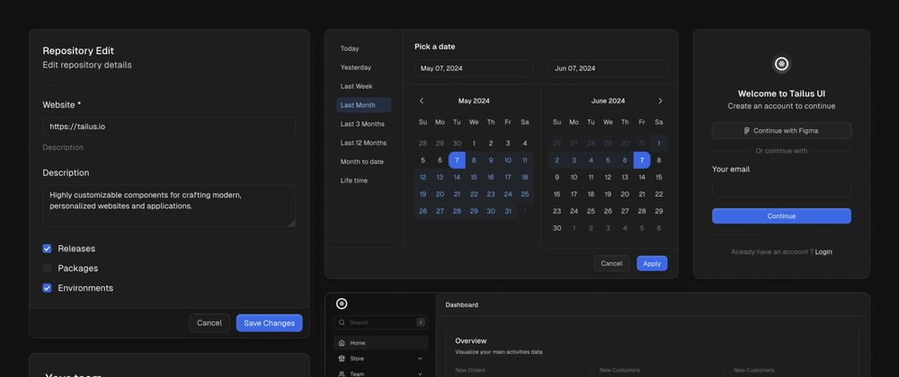
Tailus UI React is a modern React UI Kit for building custom, accessible web UIs on top of Radix UI and Tailwind Css.
Top-level customization
When it comes to customization, Tailus UI React stands out as a highly flexible option within the realm of React UI Kits. Here’s a deeper dive into its customization strengths:
Component Part Variants
Tailus UI React offers more than just pre-built components. It provides the ability to customize individual parts within each component using variants.
For example, consider the Annonce component. You can modify the variant and size of the <Annonce.Root /> part, change the variant, intent and size of <Annonce.Concern />, and even add a <Annonce.Message /> with its own unique variants. Each part can be customized independently, giving you the flexibility to create highly tailored user interfaces.
Theme Customization
Tailus UI React allows you to tailor the overall theme by using data attributes. This method simplifies the process of adjusting various properties such as palette colors, border radius values, background and border shades, and shadows.
For instance, imagine you’ve set the border radius for your entire app theme to xl. With Tailus UI React, you have the flexibility to override this setting and adjust the border radius to 2xl for a specific component, simply by using data attributes.
This approach is superior to using the “className” property for components that need to calculate their border radius based on the border radius of their parent component. With data attributes, you can directly and independently adjust the theme of each component, providing a more intuitive and flexible customization process.
Css Variables
While theming is based on data attributes, you can also use CSS Variables to customize your theme.
Why is Tailus UI React better than Shadcn UI
Both Tailus UI React and Shadcn leverage Radix UI and Tailwind CSS, but Tailus UI React takes customization a step further:
Built in Palette colors
Tailus UI React comes with built-in palettes that leverage familiar Tailwind CSS defaults, making it easier to quickly start building your UI.
Multi theming support
Tailus UI React empowers you to create multi-themed applications with ease.
Component part variants
Tailus UI React components offer granular customization through part variants.
Data attributes
Tailus UI React empowers you to customize your theme with ease using data attributes. This approach simplifies adjusting various properties for both the entire application and individual components.
Shadcn offers a solid foundation with Radix and Tailwind, but Tailus UI React empowers you to achieve a truly unique and tailored user interface through its superior customization features.
With component part variants, data attributes, thoughtful design choices, and CSS variables, you can achieve a high level of design control without sacrificing development speed.


Top comments (15)
I really appreciate your work and I can use some of the components which are missing in other libraries.
But when you bring the comparison with Shadcn I really cannot see any significant advantage of Tailus because I usually customize Shadcn components in my projects and it is not that hard.
And as far as theming goes I can create my own themes without depending on Shadcn which keeps my application independent of external factors unlike Tailus where I have to depend on
@tailus/themerShadcn is different from others because it creates components in your applications so you don't have to import it from Shadcn when you use it and just use it like natively built components. All this keeps my app less bloated. And major benefit is I can use CLI to add components
I suggest you try Tailus, you'll change your mind.
In most cases you won't even need to customize components using classNames as each component comes with several variants.
With Tailus also, the components are added in your application.
And spoiler alert, our CLI is under development and won't just be used to add or update components.
The only way for you to see the advantage of Tailus over Shadcn is to give it a try.
Personally, I can't give a fair and accurate opinion since I haven't used shadcn and I haven't tried Tailus yet. I plan to try both on a simple project, and then I'll be able to give a real opinion. Let's give Tailus React a chance before jumping to conclusions.
One of my concerns is the same design everywhere. Nowadays, most of the stuff from the shadcn community looks like Vercel. I'm not saying this is always the case, but... you'll see that it often is...
I like the component website.
I noticed you used astro but W
which framework on top of it and template did you use ?
We didn't use a template it's built from scratch, and we use React.
Thanks, looks great
Out of interest, is the use of the French spelling of “Announce” (“Annonce”) intentional?
Yes it is
I hate this thing when people see a new thing and immediately throw the more mature or just previously used one. (Even though it's not what you mean but still ...)
I mean things like:
(Compare or show the details but please don't use this type of title, or maybe it's just me who hate's this type of title)
By the way, This is a good library to use.
I also hate this kind of title tbh
I’ve read something about this in Reddit (I think). I’ll give it a try. It has lots of positive comments and feedback. Thanks for your work.
I'm having a go at this 🤝
I'm a fan of your work!! Amazing job! I love even the UI of the landing that is showing the potential of the SDK.
Seriusly great job.
Antonio, CEO & Founder at Litlyx
Bye !
Some comments may only be visible to logged-in visitors. Sign in to view all comments.