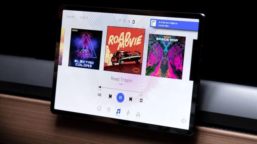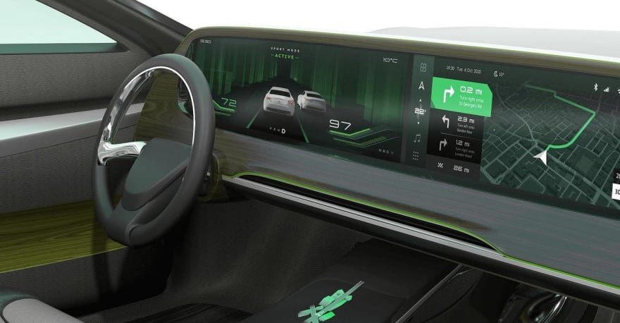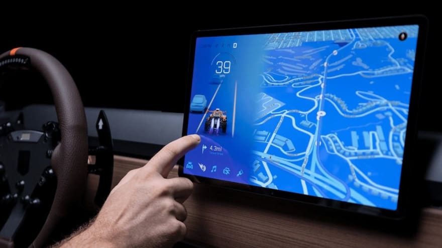
There was a time when human interaction with computers was relatively basic. Over time, the Human-machine interfaces (HMI) have added complexity in the hopes of blurring the seams of technology and real life meet. If you follow the trends that have been occurring in the automotive industry, you can see how HMI has evolved over time. Gone are the days of knobs and physical controls and here is the interface of the future. But is this the future we all really want?
How It Works
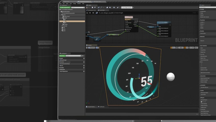
Source: Unreal EngineMuch like those Triple-A video games that shine on that new PS4, 3D engines like Unity and Unreal Engine have been gearing up for this transition to these next generation displays. Unity collaborated with Elekrobit’s GUIDE, which platform powers many in-car UIs today, to drive this next generation of engagement. Designers can design the instrument cluster and safety-relevant content in Elekrobit’s GUIDE that has been proven to work for the basics. For the more contemporary 3D navigation and games, designers can leverage Unity’s real-time 3D rendering engine and graphics capabilities to emerce the user. While Unreal Engine doesn’t have a partnership with EB, they have a HMI specific for cars that has been used in the latest Hummer.
Advantages

The images of the prototypes are extremely compelling for the future of in car displays. It is an extremely immersive design that wraps the users in this content. There are plenty of bad infotainment systems out there in cars today (just look at the Honda Civic), and they are rapidly showing their age. Ever since the Tesla Model 3, consumers have shown that they want better infotainment systems in their cars that give the users a more modern experience. Car manufacturers have historically been terrible at designing and implementing these systems, so it is exciting to see big name 3D engine applying a new approach to this problem.
Disadvantages
 Source:
Unreal Engine
A volume knob is an extremely underrated feature in cars and removing it for an entirely virtual experience is a terrible idea (just ask Honda). While these systems look awesome, they don’t seem to add that much value in my opinion. They take away from the importance of focusing on the road and your surroundings. And maybe as we go toward the future of full self-driving this isn’t an issue, but as of today it is a big deal. The best feature of a car is the safety, and the designers and engineers of these systems need to prioritize that over everything. The best graphics in the world aren’t good enough to substitute the safety of a vehicle. But arguably a bigger disadvantage of these systems is the over the air updates. Don’t get me wrong, it’s awesome to get new features without having to buy a new phone, but cars are not phones. There was a long period where most people were getting a new phone every ~2 years to keep up with the new features and processing power. It isn’t feasible for everyone to get a new car every 2 years just for software features. But putting a processor in a car with inevitability dates the device and it will get out of date faster than before. I think that we should think long and hard about how to support the longevity of cars and the software inside of them.
In conclusion, I’m excited for HMI in automotive technology but I’m not convinced that the future is going to be better than the knobs and tangle features we have today. If you were a designer or engineer tasked with making one of these systems, how would you go about implementing a system like this?


Top comments (0)