Today I'll guide you to make a Analog Clock using Javascript. This will relatively be an easy tutorial and the main goal of this post is to understand how we can use Javascript to create a simple analog clock. So, although the main focus will be on Javascript, I will try to cover the basic structuring and CSS a bit, so that you can make it on your own comfortably.
This is a practise project from Wes Bos - Javascript30. Make sure to enroll in the course to learn more about Vanilla JS. Don't hesitate, it's free.
What will we make ?
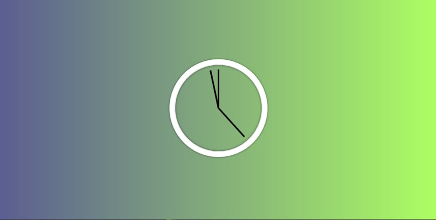
Let me post the image of the final product so that you can see for yourself what we will be building up:
So, as you can see it's not some fancy hi-fi clock but a simple clock that tells the time correctly - and at the end of the day, that's what clock do.
What is our goal here ?
- Get the current time
- Configure our hour, minute and second hand so that they show current time.
- Display the time in the UI.
How will we do this ?
- Give individual class to hour, minutes and seconds in HTML.
- Create a function that runs in every 1 seconds.
- Update the time pointers.
If this seems confusing, it's okay. You'll understand what it means as we start doing it.
So, first of all we organize our HTML code. Here's how we're writing our HTML Code.
 <div class="clock">
        <div class="clock-face">
            <div class="hand hand-hour"></div>
            <div class="hand hand-minute"></div>
            <div class="hand hand-seconds"></div>
        </div>
    </div>
So, as you see we've given a "clock" <div> element and inside it we've nested hand-hour, hand-minute and hand-seconds respectively.
Let's move on to the styling. The CSS we use is simple and just for making the clock actually seem a bit nicer.
html {
        background: linear-gradient(to right, rgba(90, 93, 145, 1) 0%, rgba(173, 255, 99, 1) 100%);
        text-align: center;
        font-size: 10px;
    }

    body {
        margin: 0;
        font-size: 2rem;
        display: flex;
        flex: 1;
        min-height: 100vh;
        align-items: center;
    }


    .clock {
        width: 30rem;
        height: 30rem;
        border: 20px solid white;
        margin: 50px auto;
        border-radius: 100%;
        position: relative;
        padding: 2rem;
        box-shadow:
            0 0 0 4px rgba(0, 0, 0, 0.1),
            inset 0 0 0 3px #EFEFEF,
            inset 0 0 10px black,
            0 0 10px rgba(0, 0, 0, 0.2);
    }


    .clock-face {
        position: relative;
        width: 100%;
        height: 100%;
        transform: translateY(-3px);
    }

    .hand {
        width: 50%;
        height: 6px;
        background: black;
        position: absolute;
        top: 50%;
        transform-origin: 100%;
        transform: rotate(90deg);
        transition: 0.3s all;
        transition-timing-function: cubic-bezier(0.1, 2.7, 0.58, 1);
    }
We've basically centered our clock to the middle of the webpage and then added small changes like border-radius so that is appears in rounded-shape. Furthermore, we do not have separate hour, minute and hour hand as in real clocks ( I mean seconds hand is longer, minute hand is a bit shorter and hour hand is as short at Kanye West).
If you still wonder the cake of the clock and how it is performed it is fairly simple. We've added position-relative to the .clock-face and then .hand which is the child of .clock-face has absolute positioning. We've used transform: rotate(90deg) because we want the clock hand to face exactly 12:00. The transform-origin:100% is used to align the clock-hand to the center of the clock-cirle. Last but not least, transition-timing-function is added and given cubic-bezier for a smooth transition effect while the hand of the clock moves. (You'll see it in demo)
Adding Functionality with Javascript
Let's see how we can make a running clock and how do we achive it, in a very simple manner.
1. First we select the hour, minute and seconds in HTML.
As we know we have to update our clock hand, we first select the hours, minute and seconds.
    const hourHand = document.querySelector('.hand-hour');
    const minuteHand = document.querySelector('.hand-minute');
    const secondHand = document.querySelector('.hand-seconds');
As now we've selected the hour, minute and second hand, we now create a function that handles the clock events. We'll call this function getTime().
So, to get the current time we use Date() object provided by the Javascript. If you've new to Javascript, you can just open your Developer Console (Fn+ F12 in Mozilla Firefox) and write Date() and it will provide you the current date.
So, we use the same Date() object to get the hour, minute and seconds that we need to make up our clock.
const now = new Date();

const seconds = now.getSeconds();
const minutes = now.getMinutes();
const hours = now.getHours();
This will give the current seconds, minutes and hours respectively. You can check by logging them to the console.
Now, since we've got our date(h/m/s), we want the handle of the clock to respond to it right ? And what we need to remember is that the clock rotates 360 degree right ? So, we want to convert the rotation of the handle of the clock into 360 degrees.
  const secondsDegree = (((seconds / 60) * 360));
  const minutesDegree = (((minutes / 60) * 360));
  const hoursDegree = (((hours / 60) * 360));
What we've done above is that basically we've taken seconds from the current time, divided it by 60 and then multiplied by 360 so that we can know where the handle of the clock will eventually point while showing the time.
It means if seconds is 45, we convert to (45/60)*360 which in turn gives us 270, which will be the degree which the clock handle points to.

Up until now, we've got a fair understanding of how our clock should react to the current time. But the code above will not point to the current time. Why ?
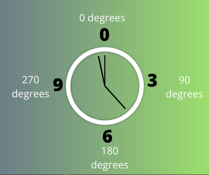
It is because as I've mentioned earlier we added 90deg rotation in our CSS so that initially our clock would always point at 12:00:00 or 0:00:00. So, in order for our clock to point at current time, we must add 90 deg rotation.
And eventually, after that we want our clock handle to rotate. We simply use style.transform to rotate the clock as per the value we've calculated. Here's how our JS code will look like:
   const now = new Date();

        const seconds = now.getSeconds();
        const secondsDegree = (((seconds / 60) * 360) + 90);
        secondHand.style.transform = `rotate(${secondsDegree}deg)`


        const minutes = now.getMinutes();
        const minutesDegree = (((minutes / 60) * 360) + 90);
        minuteHand.style.transform = `rotate(${minutesDegree}deg)`


        const hours = now.getHours();
        const hoursDegree = (((hours / 60) * 360) + 90);
        hourHand.style.transform = `rotate(${hoursDegree}deg)`
So, let's see how our final code will look like :
<!DOCTYPE html>
<html lang="en">

<head>
    <meta charset="UTF-8">
    <meta name="viewport" content="width=device-width, initial-scale=1.0">
    <title>JS CLock</title>
</head>

<body>
    <div class="clock">
        <div class="clock-face">
            <div class="hand hand-hour"></div>
            <div class="hand hand-minute"></div>
            <div class="hand hand-seconds"></div>
        </div>
    </div>
</body>
<html>
And our CSS Code will be:
html {
        background: linear-gradient(to right, rgba(90, 93, 145, 1) 0%, rgba(173, 255, 99, 1) 100%);
        text-align: center;
        font-size: 10px;
    }

    body {
        margin: 0;
        font-size: 2rem;
        display: flex;
        flex: 1;
        min-height: 100vh;
        align-items: center;
    }


    .clock {
        width: 30rem;
        height: 30rem;
        border: 20px solid white;
        margin: 50px auto;
        border-radius: 100%;
        position: relative;
        padding: 2rem;
        box-shadow:
            0 0 0 4px rgba(0, 0, 0, 0.1),
            inset 0 0 0 3px #EFEFEF,
            inset 0 0 10px black,
            0 0 10px rgba(0, 0, 0, 0.2);
    }


    .clock-face {
        position: relative;
        width: 100%;
        height: 100%;
        transform: translateY(-3px);
    }

    .hand {
        width: 50%;
        height: 6px;
        background: black;
        position: absolute;
        top: 50%;
        transform-origin: 100%;
        transform: rotate(90deg);
        transition: 0.3s all;
        transition-timing-function: cubic-bezier(0.1, 2.7, 0.58, 1);
    }
And finally, the meat of the tutorial, our Javascript Code will look like this:
 const hourHand = document.querySelector('.hand-hour');
    const minuteHand = document.querySelector('.hand-minute');
    const secondHand = document.querySelector('.hand-seconds');


    function getTime() {
        const now = new Date();

        const seconds = now.getSeconds();
        const secondsDegree = (((seconds / 60) * 360) + 90);
        secondHand.style.transform = `rotate(${secondsDegree}deg)`


        const minutes = now.getMinutes();
        const minutesDegree = (((minutes / 60) * 360) + 90);
        minuteHand.style.transform = `rotate(${minutesDegree}deg)`


        const hours = now.getHours();
        const hoursDegree = (((hours / 60) * 360) + 90);
        hourHand.style.transform = `rotate(${hoursDegree}deg)`


    }

    setInterval(getTime, 1000);
The setInterval(getTime,1000) runs getTime() function every 1000 milliseconds i.e. every seconds. So it means the function getTime() runs every seconds and then updates out HTML Code as the value calculated.
Woo Hoo! You've created a basic working JS Analog clock and making this I hope you've learnt some concept of the plain Javascript.


Top comments (7)
just one question, why those extra parentheses?
I mean it could have been
((seconds / 60) * 360) + 90instead of(((seconds / 60) * 360) + 90)It's just a personal preference. I find my code more readable so I tend to use those parantheses. :D
oh yeah, I understand that. There were identified as issues in SonarQube in one of my projects and I was like why dont you like this? :D
I think it's just preference
Nice but needs some corrections :
const hours = now.getHours();
const hoursDegree = ((((hours+minutes/60) / 12) * 360) + 90);
How did you fix the issue of the second-hand "glitch rotate" when it gets to the 12hr mark? The sudden return to the 90deg transform?
You need to remove all of the transition part:
transition: 0.3s all;
transition-timing-function: cubic-bezier(0.1, 2.7, 0.58, 1);