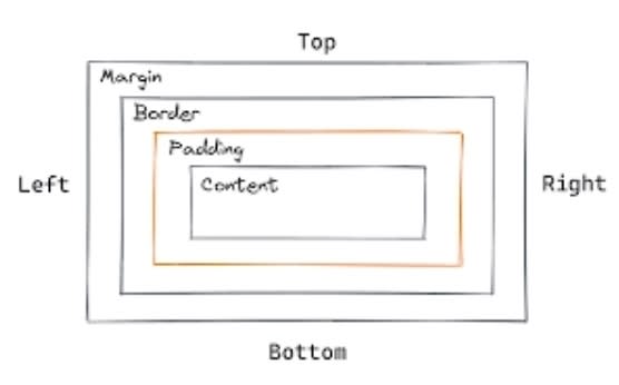
Creating a website that is both visually appealing and user-friendly is a fundamental aspect of web development. While typography, layout, and picking the right colours are important, understanding how to effectively use padding, borders, and margins is equally crucial. As a developer, you’re expected to have this knowledge at your disposal, because they play a significant role in controlling the spacing and layout of your web content. In this article, we will explore the best practices for arriving at the right padding, border, and margin for your website.
1.Understanding the Basics:
Firstly, let’s clarify the basic concepts of padding, border, and margin;
Padding: This is the space or distance between the content and the edge of the element.
Border: This is the surroundings of the element.
Margin: This is the space between any element or the edge of the screen.

2.Be Consistent:
Consistency is very important in your website’s design. When setting the values for padding, border, and margin, always strive for uniformity throughout, because this helps create a professional and cohesive appearance. Establishing a consistent spacing style for all elements is bound to enrich the user of your website.
3.Balanced Spacing:
Having a balanced padding, border, and margin is crucial for great readability and aesthetics. The following tips can help you achieve it;
•Always keep the padding within the elements decent to avoid excessive white space inside components.
•Always ensure that the borders match your website’s design language, so they are neither too bold nor too subtle.
•Excessive Spacing could make your content seem disconnected, so prudently use margins to separate different sections of your website.
4.Responsiveness:
In today’s world where the use of mobile devices are at an all-time high, making your website responsive is a must. Utilize relative units like percentage or ems for padding, border widths, and margins instead of fixed pixels. This enables your website to adapt effortlessly to various screen sizes and orientations.
5.Leverage the Box Model:
Having a great understanding of the CSS box model is fundamental. Remember that the width of an element is the sum oqf its content width, padding, border, and margin. Adjust these properties accordingly to achieve the desired visual result without unexpected layout issues.
6.Utilize CSS Frameworks:
Bootstrap and Foundation are CSS frameworks that offer predefined styles and grids, including sensible defaults for padding, border, and margins. Utilizing these frameworks properly can speed up development and guarantee a consistent look and feel.
7.Testing and Iteration:
Web development is a constant iterative process. After implantation of padding, borders, and margins. Also, thoroughly test your website on different devices and browsers. This step is crucial to identify and resolve any spacing issues that may occur.
When creating your website, getting the right padding, border, and margin is crucial, by maintaining consistency, implementing responsive web design principles, and utilizing CSS frameworks, you can create visually appealing, and user-friendly websites that leave a positive impression on your visitors.
For further actions, you may consider blocking this person and/or reporting abuse


Top comments (0)