With Parabeac’s latest update, we now officially offer three different project types: Themes, Components and Screens. While Components and Screens have been included in previous iterations of our Figma to Flutter conversion tool, we’re excited to offer an entirely new function: Themes!
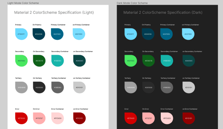
Maintaining consistent brand colors and styles is critical to making a polished and cohesive user experience. Parabeac addresses this directly with its new project type. Themes is capable of not only created ColorStyles and TextStyles, but “light” and “dark” themes (as specified in (Material Design 2)[is capable of detecting Material Design elements, as well. Having a generated list of colors and styles devs can easily reference, makes the entire process of coding an app’s UI not only easier, but faster as well.
We recently released a video demo on how this works here, but let’s dive into how to make this happen:
-
Create a Style Sheet in Figma
Clone our existing sample style sheet, and edit it to match your desired application colors. (or create your very own Figma file!)
-
Convert your Figma design to Flutter using [Parabeac] Cloud](app.parabeac.com)
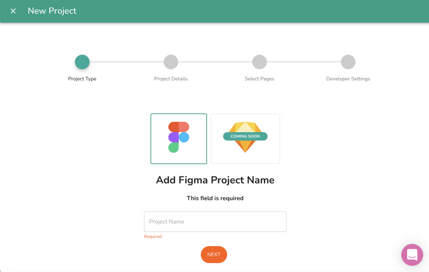
The process is very similar to how we’ve converted projects in the past. All you need is the link to your Figma file and access to your Figma account (either through a personal access token or by logging in through Parabeac).
-
Use the themes in your project
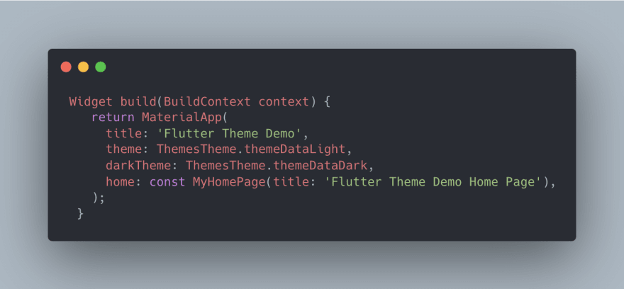
Import the generated .g.dart files to an existing project, or build a new application on the Parabeac generated project files. If you created light or dark themes, you can call them as normal—otherwise you can call individually generated colors. As usual, all names correspond to how they were labeled in Figma.
For more tips and tricks on how to use Themes, check out this handy article written by our very own CTO, Ivan Vigalante.
For more detailed information on how themes work or how to generate them using Parabeac, check out our documentation here.


Top comments (0)