UI development is an interesting topic that can sometimes be a bit unclear. We all know that UI stands for User Interface, so a UI Developer is someone who focuses on designing and developing the user interface. It may sound straightforward, but, the responsibilities of a UI Developer encompass much more than meets the eye.
In this article, we’ll explore 5 wonderful tips that are widely recognized as excellent design practices.
Consistency & Alignment
Consistency means keeping a consistent appearance across your interface. This includes using the same colors, fonts, and design elements. For instance, when you use the same button style and color throughout your application, it ensures a seamless and predictable user experience.
Alignment refers to the placement of elements relative to each other or a common baseline, creating a sense of order and visual harmony. For example, vertically aligning form labels and input fields makes the form appear organized and easy to read.
Constraining Whitespace Content
This is an incredibly easy method for anyone, Just ensure that your elements are perfectly aligned, down to the smallest detail, and that the spacing around each element is consistent and balanced.
Have in mind that white space works as an invisible border. If you feel like you need a limit to separate two sections, maybe all you need is white space!
Color palettes and theory
Color theory is the study of how colors interact and influence one another and the emotions and perceptions they evoke. In UI design, color helps guide users’ attention, convey information, and create a cohesive visual experience.
In UI design, it’s important to pay attention to Color & Contrast because, without them, even websites with the best UI can end up looking unappealing.
Maintain a healthy text/color relationship by following these simple guidelines:
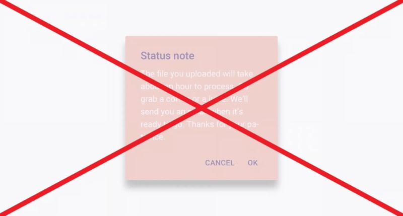
- Always avoid low contrast between text and background.
- Don’t use complementary colors for text and background, especially when the colors are of similar brightness and saturation (e.g., yellow text on a purple background).
- Even on white backgrounds, don’t set body text in bright colors. Black and dark gray are the easiest to read.
Typography
Typography is an important part of UI design. It’s all about choosing and arranging fonts, sizes, and spacing to make the interface look good and be easy to read.
For frontend developers, knowing about typography means thinking about things like which font to use, how to organize the text, and making sure it’s easy to read. This way, the text will look nice, convey the information well, and help create a good user experience.
Visual hierarchy
Hierarchy refers to the arrangement of design elements in order of importance, guiding the user’s attention through the interface. For example, using larger fonts for headings and smaller fonts for body text helps users easily distinguish between different sections.
For example, Contrast helps establish a visual hierarchy, making it easy for users to understand the relative importance of different elements on the screen. For example, Your Call To Action button stand out by picking a color, style, and text that make it look different from the other things on the page. Where you put that button is also really important. Check out this post to find out the best ways to position your CTA.
Conclusion
In this article, we discussed some UI ideas that can assist you in creating a more appealing UI. and as I mentioned before, UI is more than what meets the eye.
I hope this article has brought some new knowledge your way today. If you found it enjoyable and helpful, please don’t hesitate to give me a couple of reaction! 🦄
Please leave a comment with your feedback.
If you’d like to support me as a writer, consider Following me on Dev, and Connecting with me on LinkedIn.


Top comments (0)