Welcome to day two of the useaffiliates.com build log! This series covers my journey of building a business from scratch in public. If you missed day one, you could check it out here. I also uploaded today's Twitch stream to YouTube if you want to watch the replay.
Design, design, design! ✏
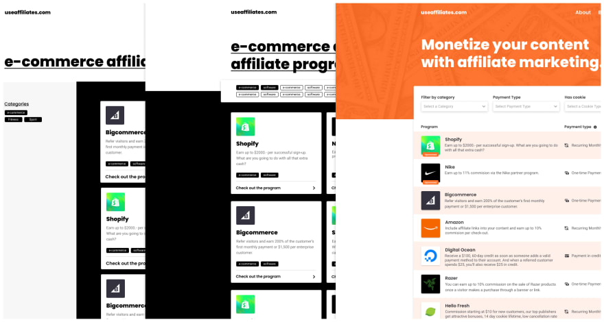
Yesterday we worked on coming up with a design language. We explored font pairs and even made a couple of variants for the homepage. However, when I looked at the designs today, I wasn't happy with what I designed yesterday.
The designs looked too dull, and I wouldn't want to use a site that looked this way. More importantly, the page was missing a lot of functionality, including filters, which for a listing site, the users must get to their content quickly.
It needed some color 🌈
I changed my mind on only using black and white as the color pallet. The site didn't have any personality, and once I stumbled upon a shade of orange when searching for a header image for the home page, I was sold. Adding in the orange color pallet lifted my design from "meh" to "hey, I am on to something here!".
Listing the data in a new way 🧹
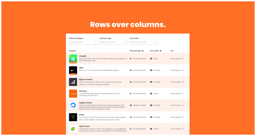
Having found some personality via the color pallet, I also reworked how the data is listed. I took inspiration from famous job boards and placed the data into rows instead of columns.
Besides it making the data appear more structured (as opposed to cluttered columns variant), it also gave me a lot more horizontal space to work with. I utilized this extra space to include more helpful information about the affiliate programs without cramping it all inside a column.
The added benefit of listing the data underneath each other is that it makes it easy for users to compare the different affiliate programs' data.
Now that we have this extra space for more data, I also added three dropdown filters at the top of the list. This will make it a lot easier for creators to find an affiliate program that suits their needs without scavenging their way through many programs that are of no interest/relevance to them.
Finally, I added a "sponsored" label to the first two rows as I plan to let affiliate programs pay an extra sum for getting to the top of the list. I want to be transparent to the users when a program is sponsored, and it might even be required by law here in the EU (I only assume this since it's required for influencers on social media).
Beyond the home page. 👨🚀
When I was happy with how the home page started to look and with a handful of design elements in the toolbox, I began to explore what other pages I wanted to include before launching the product.
About us 👋
I am still unsure what content I want to include on this page, but every website has an about us page. Do I need to tailor this page towards the businesses that want to add their affiliate program to my site? Or do I need to tailor it towards the creators? Or both? Do I need two about us pages, maybe? Let me think about it some more... Or if you have a suggestion, let me know!
The about us page will also be the template for the other content pages, as we likely also need to include a terms & conditions page and a privacy policy. Before we add those pages, I will have to research what legal information I need to include.
Blog overview & blog detail 📚
To get traffic to useaffiliates.com I plan to write blog posts about affiliate marketing. I might write the blogs myself, but I might also consider outsourcing this part.
Content marketing has been a recent interest of mine. This project seems like the perfect way to learn more about it. I will also look into tools like Ahrefs to write my content based on relevant keywords.
Contact page 📨
I am thinking about making this just a mailto: link. We can take a shortcut here (timewise) to launch faster.
Onwards! 🚀
I'll continue tweaking and updating the designs for the remainder of the week. With that also comes writing the copy for the pages, and I might also think of new features that I want to include on launch.
So let’s get cracking, shall we?
Thank you for reading this build log! If you want to watch me build this thing live, please check out my Twitch channel . If you rather follow along at your own pace, my stream archive over on my YouTube channel might be the right place for you!
Stay tuned for a new build log tomorrow!
With love,


Top comments (0)