As a science teacher, I LOVE data visualizations. I love how a strong visualization combines the fields of art, science, mathematics, and humanities to tell a story, and I love the interactive and exploratory aspect of visualizations. However, in a lot of visualizations, the designer makes all/most of the decisions about what data to display, and how to display it to tell a specific story from a specific point of view.
But as a teacher, I prefer the visualizations that allow the user to make more of these choices themselves, guided by their own questions, seeking answers and further inquiry. So as I started my journey in creating data visualizations, I knew I needed to make something that would render the data based on user input, and that sparked the concept for my current project-in-progress, the COVID-19 World Tracker.
First, check out a quick video demo and skim through the README.md file for a quick tour of the project.
Designing and Planning User Interaction Goals
My design choices were centered around this guiding question:
How can I display data and options that will allow the user to generate open-ended questions and freely investigate those questions to better understand the COVID-19 outbreak?
My goal was to develop a simple platform in which users could easily explore and compare the COVID-19 outbreak on a global scale, using real-time global data as well as looking at historical data throughout the outbreak. The map visualization portion of the app allows for quick analysis of current case data, and allows users to explore possible correlations between case numbers, severity of cases, and how the data looks when overall population is taken into account. The bar chart portion of the app allows users to compare the evolution of the outbreak from the first reported case in each country, through selecting a "collection" of countries for comparison. The two halves of the app operate together - ideally, after exploration of the global map, a user would be curious to dig deeper and compare certain countries based on what they saw in the map.
The remainder of this post will explain how I combined the React.js user interface with D3.js to achieve this goal, allowing users to be more in control of the data they explore, the questions they ask, and the understandings they walk away with. This post will focus on the map visualization, while my next post will focus on the bar charts.
Exploring Real-Time Global Data Using the World Map Visualization
The Available Data
The map data was fetched from the Novel COVID API. I chose this API because it pulls data from a variety of reputable sources, and includes consistent current data for every country. Here is an example of the data entry for Afghanistan:

Creating Options Based on Available Data
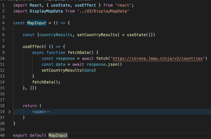
First, this data is fetched using the useEffect() hook in the MapInput component (React.js).

I used the keys for each of the data points (cases, deaths, population, etc) to organize a series of user input buttons in the MapInput component. The component renders a series of buttons, which when clicked, call the DisplayMapData() function (D3.js) with arguments related to the specific data the user wants to display on the map. For example:
<button
    onClick={event => DisplayMapData(event.target.value, event.target.innerText, countryResults)}
    className="cases block"
    value="cases">
        Total Cases
</button>
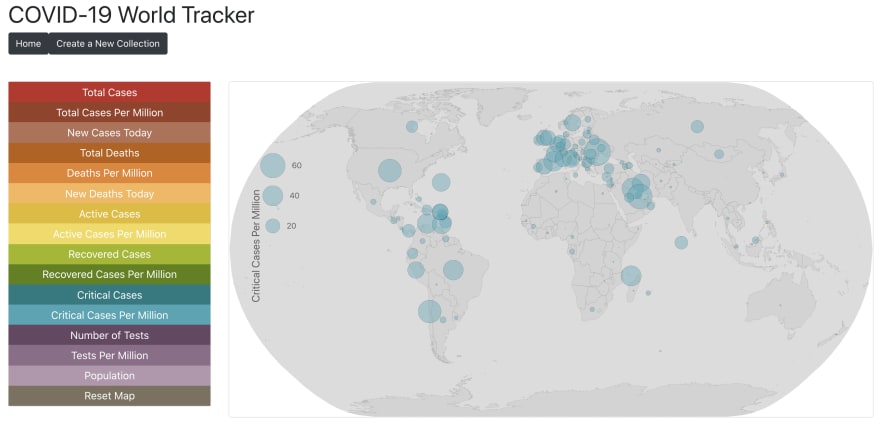
With a little bit of css button styling and react-bootstrap Row-Col-Card formatting, I created the left sidebar menu of options:

Visualizing the Data Selected by the User
From here, the DisplayMapData(caseType, caseTitle, data) function uses the arguments passed down to parse the data by the user input (caseType) to plot only that selected data on the map, using each country's geographic coordinates supplied by the countryInfo object within the data object. This function first removes any data related to the last selection (country circles, the legend, and the title), and then renders that information for the most recently-selected caseType.
You can view the code for the DisplayMapData() function in my repository
Adding Additional Interactive Features
Finally, I built in additional interactions so that the user could further explore the map and the data. This included:
- Zooming and Panning the map view
- Highlighting country boundaries and displaying country names
- Displaying country data when hovering over each data circle
Comparing Country-Specific Historical Data Using the Bar Chart Visualizations
Keep an eye out for Part 2 of this post, describing the Bar Chart Portion of the App.
Final Thoughts
As a novice programmer, this project has forced me to dramatically grow my skill set in the past two weeks. I have a lot more to learn about D3.js. I plan to continue practicing making different types of visualizations with complex data sets, while always keeping the user experience and opportunities for self-directed inquiry at the forefront of my designs.
This project is by no means complete, and I will share a link to the live project in a few weeks. In the meantime, keep an eye out for my weekly updates to see how the project evolves.
And if you made it this far - Thank you for reading!
Leave a comment below and let me know:
- What kind of user experience would you like to see in visualizations like this?
- What additional features or interactions should be added?
- Is there other COVID-19 data you would like to explore in this way?


Top comments (16)
Thanks for this article. I can't believe this is the first time i am coming across
Novel covid19 API.I was impressed by how many data points were included for each country in this API, but overall, I think I prefer the API that I used for the bar charts because it has so many different specific endpoints for longitudinal data. Info about that API is in the second post.
This is really great! I used leaflet and react-leaflet to build something like this.
Thank you! I would love to see your app or repo if you don’t mind sharing.
Sure!
This looks great! I'll have to explore react-leaflet sometime soon. I really like that when you zoom in on your map, the scale changes so that the circles are no longer overlapping. I need to fix this with the scaling on my map. In some views, some of my smaller country circles are completely "covered" by larger circles, so they cannot be hovered over. Thank you for sharing!
Glad you liked it!😁
I took a peek at your repo to see how the zooming worked so that circles didn't overlap when you zoom in. I could see that you had the zoom={1}. Is that just the initial zoom value for the base map? Does leaflet or react-leaflet take care of re-sizing the circles automatically for you?
Yup! The zoom refers to the initial zoom of the base map. As for the resizing effect of the Circle Markers, there isn't actually any code behind it. The radius of the circles are a function of the number of confirmed COVID cases in the region and the centers of the circles are the latitudes and longitudes of the region. Thus, if you zoom into the map, the lat and long points, i.e, the centers move away from each other while the radius remains the same. This causes the circles to not overlap when zoomed. Hope this could help!😊 Take a look at the CircleMarker element in Map.js for the radius and center.
OK, that makes sense. I decided to fix mine by just sorting the data in descending order so that the largest circles are drawn first, with smaller ones on top, so now any circle can easily be hovered over to view the data. Thank you for helping think through the options!
Glad I could help! 😊
Holy petes you've been busy. This looks and sounds amazing - cannot wait to see the final product. You are on fire!
Congratulations! I've made an application using d3.js with Angular 9 for brazilian data. You can check on: covid19br.info
Thanks for sharing your site! I love the visual design and layout of yours - that is something I need to work on. I also really like the small charts at the top - even though they are small they tell a story. What tech stack did you use for this?
Just finished up my application (for now): You can view it on github pages
jessesbyers.github.io/covid19_worl...
thanks for sharing it is amazing!