I’ve spent about 9 years here at Hanley Wood and have watched as we’ve painstakingly managed the designs of 20+ different websites. We’ve reduced much of our workload by reducing the variance of our page templates and minimizing the amount of code needed to spin up a new website.
Below I’d like to share with you some of the things that have helped us over the years in hopes that they’ll help you too. ;)
Animate.css

Animate.css is a convenient little CSS library created by Daniel Eden that takes the hard work out of adding animations to your website. It’s cross-browser and easy to use, so give it a try!
Here’s an example, taken from the Github repo, demonstrating how easy it is to add an animation to a component:
<h1 class="animated infinite bounce delay-2s">Example</h1>
Website : https://daneden.github.io/animate.css/
Font Awesome
Font Awesome is a personal fave of mine. Gone are the days where you need to buy or create an icon. Here, we have a useful font that contains most of the icons you’ll need for a project. We use them frequently on our Hanley Wood sites.
<span class="fa fa-search"></span>
Website : https://fontawesome.com/
Hamburgers
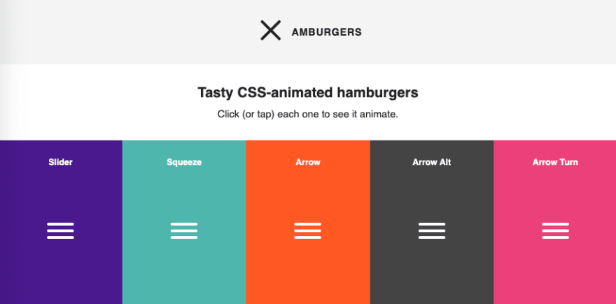
This one is another easy library. Why spend your time trying to figure out how to animate that stupid hamburger? Thanks to Jonathan Suh, we now have a way to animate our hamburgers without having to try!
Example from the website:
<button class="hamburger hamburger--collapse" type="button">
  <span class="hamburger-box">
    <span class="hamburger-inner"></span>
  </span>
</button>
Website : https://jonsuh.com/hamburgers/
Tachyons
I recently learned about Tachyons from a colleague, and I only wished I had known about it sooner. Tachyons is a framework based on the principle of Atomic CSS by utilizing singe-use CSS classes to style components. We have slowly been incorporating this methodology into our websites so that we can focus more on new features as opposed to maintaining ridiculous amounts of CSS code. Spinning up new sites now takes less time and produces less design bugs as opposed to previous approaches. Why? Because the modularity of the CSS styles reduces complexity and increases reusability.
The example below styles the div as follows:
- position: static
- width: calc(33.33333333%)
- display: flex
- justify-content: flex-end
<div class=”static w-third-ns flex justify-end”>…</div>
Website : http://tachyons.io/
Conclusion
These are the top 4 tools I’d love to bundle up and give to anyone starting a new web project. Focus your time on creating new and interesting web features and spend less time getting the blueprint of the site up and running.


Top comments (0)