 Day 9 of⚡️ #30DaysOfWebPerf ⚡️
Yesterday we talked about srcsets and sizes, but what is device pixel ratio? What size images should we provide?
We want our images to look good, but we also don't want to send unnecessary bytes down the wire.
[gif alt: Will Farrell rubbing chin]15:03 PM - 13 Nov 2019
When we define an image width in our styles, we are saying what we want the display size to be, regardless of screen quality.
Some screen have higher pixel densities - like Retina. It is a "2x" screen because it can display a 1000 pixel width image in a 500px spot.15:03 PM - 13 Nov 2019
 In this exaggerated example, the natural width of the bantha doggo on the left is 150px, then 300px, then 600px. The display width is 300px, and my screen has a DPR (device pixel ratio) of 2.
150px is fuzzy. Looking closely, the middle image is not the best quality either.15:03 PM - 13 Nov 2019

 Let's talk about Dev Tools. To find your screen's DPR, open up the inspector, then go to the console and type:
window.devicePixelRatio
P.S. This is fun to do when you're connected to a projector.15:04 PM - 13 Nov 2019
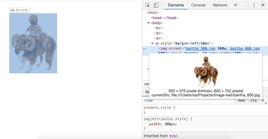
 To debug and understand which image is actually being used, inspect the image and hover on the src. Dev Tools will show:
- display size (300x376px)
- natural, or intrinsic, size of the image currently being displayed (600x752px)
- currentSrc, or filename of the displayed image15:04 PM - 13 Nov 2019
How many different resolutions do you need to provide? Science suggests humans can see 720ppi 1 foot from a screen. The iPhone 11 is 326ppi (MBP is 227) so in most cases, you're safe providing only 1x and 2x. You might consider 4x in cases of high-resolution projectors or art.15:04 PM - 13 Nov 2019


Top comments (0)