Trending Projects is available as a weekly newsletter please sign up at www.iainfreestone.com to ensure you never miss an issue.
1. Slidev
Presentation Slides for Developers
Presentation slides for developers 🧑💻👩💻👨💻
|
Made possible by my Sponsor Program 💖 |
Features
- 📝 Markdown-based - foucus on content and use your favorite editor
- 🧑💻 Developer Friendly - built-in code highlighting, live coding, etc.
- 🎨 Themable - theme can be shared and used with npm packages
- 🌈 Stylish - on-demand utilities via UnoCSS.
- 🤹 Interactive - embedding Vue components seamlessly
- 🎙 Presenter Mode - use another window, or even your phone to control your slides
- 🎨 Drawing - draw and annotate on your slides
- 🧮 LaTeX - built-in LaTeX math equations support
- 📰 Diagrams - creates diagrams using textual descriptions with Mermaid.js
- 🌟 Icons - access to icons from any icon set directly
- 💻 Editor - integrated editor, or the VSCode extension
- 🎥 Recording - built-in recording and camera view
- 📤 Portable - export into PDF, PNGs, or PPTX
- ⚡️ Fast - instant…
2. Serverless Next.js Component
Deploy your Next.js apps on AWS Lambda@Edge via Serverless Components
 serverless-nextjs
/
serverless-next.js
⚡ Deploy your Next.js apps on AWS Lambda@Edge via Serverless Components
Serverless Next.js Component
A zero configuration Next.js 10/11 serverless component for AWS Lambda@Edge aiming for full feature parity.
Please review features for a list of currently supported features.
Contents
- Motivation
- Design principles
- Features
- Getting started
- Lambda@Edge configuration
- Custom domain name
- Custom CloudFront configuration
- Static pages caching
- Public directory caching
- AWS Permissions
- Architecture
- Inputs
- CDK Construct
- FAQ
⚠️ This README reflects the latest changes on themasterbranch. It may or may not yet be published to thelatest(stable) oralpharelease in npm. Please go to Releases, find the correct@sls-next/serverless-componentversion you are using, and open the README for that release for more accurate information. If a feature is listed in this README but not working, please first try upgrading to the most recentalpharelease in npm.
⚠ this is currently using Serverless Components Beta (not GA version) as the project was started before GA. We…
3. Prism
Lightweight, robust, elegant syntax highlighting.
Prism is a lightweight, robust, and elegant syntax highlighting library. It's a spin-off project from Dabblet.
You can learn more on prismjs.com.
Why another syntax highlighter?
Contribute to Prism!
Important Notice
We are currently working on Prism v2 and will only accept security-relevant PRs for the time being.
Once work on Prism v2 is sufficiently advanced, we will accept PRs again. This will be announced on our Discussion page and mentioned in the roadmap discussion.
Prism v1 contributing notes
Prism depends on community contributions to expand and cover a wider array of use cases. If you like it, consider giving back by sending a pull request. Here are a few tips:
- Read the documentation. Prism was designed to be extensible.
- Do not edit
prism.js, it’s just the version of Prism used by the Prism website and is built automatically. Limit…
4. medium-zoom
A JavaScript library for zooming images like Medium
 francoischalifour
/
medium-zoom
🔎🖼 A JavaScript library for zooming images like Medium
medium-zoom
A JavaScript library for zooming images like Medium

🔬 Playground ・
🔎 Demo ・
📚 Storybook
Contents
Features
- 📱 Responsive — scale on mobile and desktop
- 🚀 Performant and lightweight — optimized to reach 60 fps
- ⚡️ High definition support — load the HD version of your image on zoom
- 🔎 Flexibility — apply the zoom to a selection of images
- 🖱 Mouse, keyboard and gesture friendly — click anywhere, press a key or scroll away to close the zoom
- 🎂 Event handling — trigger events when the zoom enters a new state
- 📦 Customization — set your own margin, background and scroll offset
- 🔧 Pluggable — add your own features to the zoom
- 💎 Custom templates — extend the default look to match the UI of your app
- 🔌 Framework agnostic…
5. Gestalt
A set of React UI components that supports Pinterest’s design language
Gestalt · 

Gestalt is Pinterest’s design system. Our system includes a React component library with comprehensive guidelines, best practices, tools, and resources to support designers and engineers delivering a high-quality product.
Visit the official Gestalt Documentation
Installation
The package can be installed via npm:
npm i gestalt --save
npm i gestalt-charts --save
npm i gestalt-datepicker --save
Or via yarn:
yarn add gestalt
yarn add gestalt-charts
yarn add gestalt-datepicker
Usage
Gestalt exports each component as ES6 modules and a single, precompiled CSS file:
import { Text } from 'gestalt';
import 'gestalt/dist/gestalt.css';
import 'gestalt/dist/gestalt-datepicker.css';
That syntax is Webpack specific (and will work with Create React App), but you can use Gestalt anywhere that supports ES6 module bundling and global CSS.
Development
Gestalt is a multi-project monorepo. The docs and components are all organized as separate packages that share similar tooling.
Install project dependencies and run tests:
yarn
yarn …6. KaTeX
KaTeX is a fast, easy-to-use JavaScript library for TeX math rendering on the web.
KaTeX is a fast, easy-to-use JavaScript library for TeX math rendering on the web.
- Fast: KaTeX renders its math synchronously and doesn't need to reflow the page. See how it compares to a competitor in this speed test.
- Print quality: KaTeX's layout is based on Donald Knuth's TeX, the gold standard for math typesetting.
- Self contained: KaTeX has no dependencies and can easily be bundled with your website resources.
- Server side rendering: KaTeX produces the same output regardless of browser or environment, so you can pre-render expressions using Node.js and send them as plain HTML.
KaTeX is compatible with all major browsers, including Chrome, Safari, Firefox, Opera, Edge, and IE 11.
KaTeX supports much (but not all) of LaTeX and many LaTeX packages. See the list of supported functions.
Try out KaTeX on the demo page!
Getting started
Starter template
<!DOCTYPE html>
<!-- KaTeX requires the…7. Rooks
Essential hooks to super charge your components!
 imbhargav5
/
rooks
Essential React custom hooks ⚓ to super charge your components!
Essential React custom hooks ⚓ to super charge your components!
List of all hooks
🔥 Effects
- useAsyncEffect - A version of useEffect that accepts an async function
- useDeepCompareEffect - Deep compare dependencies instead of shallow for useEffect
- useDidMount - componentDidMount hook for React
- useDidUpdate - componentDidUpdate hook for react
- useDocumentTitle - A hook to easily update document title with React
- useEffectOnceWhen - Runs a callback effect atmost one time when a condition becomes true
- useIntervalWhen - Sets an interval immediately when a condition is true
- useIsomorphicEffect - A hook that resolves to useEffect on the server and useLayoutEffect on the client.
- useLifecycleLogger - A react hook that console logs parameters as component transitions through lifecycles.
-
useLockBodyScroll - This hook locks the scroll of the body element when
isLockedis set totrue. - useMouseMoveDelta - Tracks delta of mouse move
- useMouseWheelDelta - Tracks delta of mouse move
- useWillUnmount - componentWillUnmount…
8. colors.css
Better default colors for the web. A collection of skin classes for faster prototyping and nicer looking sites.
Better default colors for the web. A collection of skin classes for faster prototyping and nicer looking sites.
Customize your own defaults here.
Stats
| 903 | 85 | 85 |
|---|---|---|
| bytes | selectors | declarations |
Installation
With npm
npm install --save-dev colors.css
With Git
git clone https://github.com/tachyons-css/colors.css
Usage
Using with PostCSS
Import the css module
@import "colors.css";
Then process the CSS using the tachyons-cli
$ npm i -g tachyons-cli
$ tachyons-cli path/to/css-file.css > dist/t.css
Using the CSS
The built CSS is located in the css directory. It contains an unminified and minified version.
You can either cut and paste that css or link to it directly in your html.
<link rel="stylesheet" href="path/to/module/css/colors.css">
Development
The source CSS files can be found in the src directory.
Running $ npm start will process the source CSS and place the built CSS in the css directory.
The CSS
…9. Draftail
A configurable rich text editor built with Draft.js. Draftail aims for a mouse-free, keyboard-centric experience.
 springload
/
draftail
📝🍸 A configurable rich text editor built with Draft.js
📝🍸 A configurable rich text editor built with Draft.js. Check out our demos!
Features
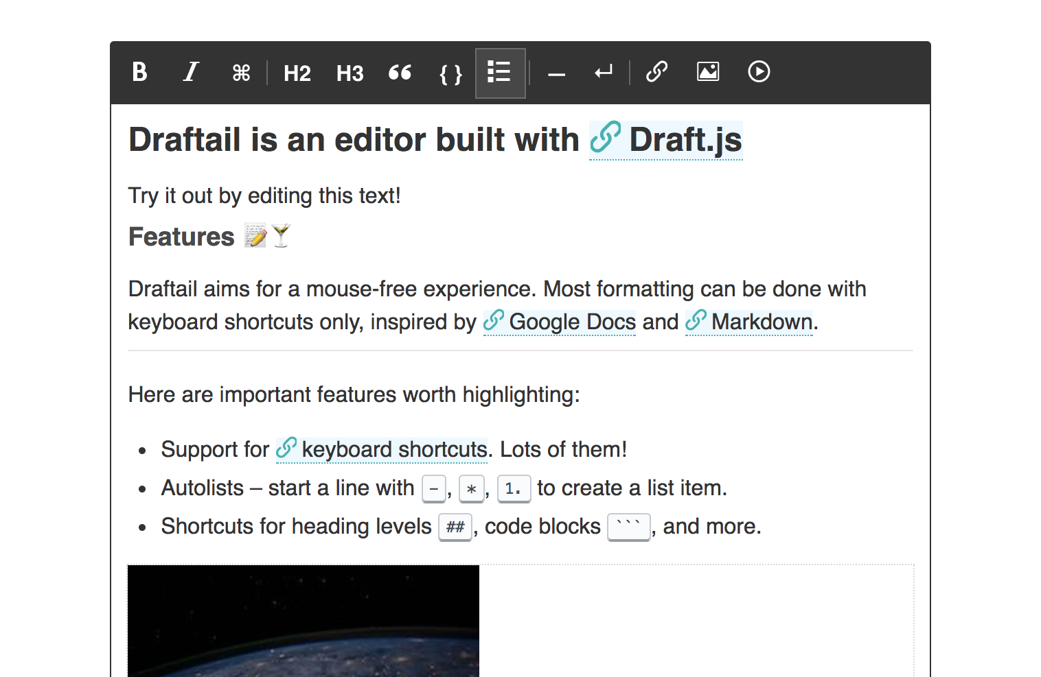
Draftail aims for a mouse-free, keyboard-centric experience. Here are important features worth highlighting:
- Support for keyboard shortcuts. Lots of them!
- Paste from Word. Or any other editor. It just works.
- Autolists – start a line with
-,*,1.to create a list item. - Shortcuts for heading levels
##, code blocks```, text formats**, and more. - Undo / redo – until the end of times.
- Common text types: headings, paragraphs, quotes, lists.
- Common text styles: Bold, italic, and many more.
- API to build custom controls for links, images, and more.
- Compatibility with the
draft-js-pluginsecosystem to build more advanced extensions.
This project adheres to Semantic Versioning, and measures performance and code coverage. We also try to follow accessibility best practices (tested with aXe)…
10. Supercons
A friendly, open source React iconset
Supercons
A friendly set of open source React icons.
→ Preview & search the iconset
Massive credit to @superbryntendo for the original set of icons & aesthetic inspiration.
Predecessor projects: spectrum-icons, @hackclub/icons
Usage
yarn add supercons
# npm i supercons
import React from 'react'
import Icon from 'supercons'

export default () => (
  <div style={{ color: 'magenta' }}>
    <Icon glyph="like" size={128} />
    <Icon glyph="cloud" size={32} />
  </div>
)
Built with/supports TypeScript.
Props
| Prop | Type | Default | Details |
|---|---|---|---|
glyph |
String, required | like |
See docs |
size |
Number or string | 32 |
Sets width & height |
as |
React component | svg |
Must render svg tag |
You can also pass any other props. Remember to make your icons accessible with aria-label or title, use aria-hidden if they’re purely…
Stargazing 📈
Top risers over last 7 days
- Coding Interview University +1,630 stars
- Web Development for Beginners +1,572 stars
- The Book of Secret Knowledge +1,447 stars
- 30 seconds of code +1,330 stars
- Public APIs +1,209 stars
Top growth(%) over last 7 days
- Mantine +63%
- useStateMachine +49%
- react-icon-blur +46%
- WinBox +32%
- Grafar +24%
Top risers over last 30 days
- Coding Interview University +6,612 stars
- Public APIs +6,491 stars
- Web Developer Roadmap +4,995 stars
- Free Programming Books +4,799 stars
- Supabase +4,753 stars
Top growth(%) over last 30 days
- github-elements +116%
- React Flow +97%
- superplate +95%
- SimpleR State +63%
- Supabase +62%
Trending Projects is available as a weekly newsletter please sign up at www.iainfreestone.com to ensure you never miss an issue.
If you enjoyed this article you can follow me on Twitter where I regularly post bite size tips relating to HTML, CSS and JavaScript.


Top comments (2)
Thanks!
That’s cool